
Brand
Buildful brand
Our logo, colors and type, and how to use them. Free to use when you write about Buildful, link to us, or build an integration.
The name
Describe Buildful
In one line
Buildful is coding superintelligence for everyone: 1,000 tasks for $10 a month.
In a paragraph
Buildful is coding superintelligence for everyone. Describe a change, and Buildful builds it in a cloud sandbox, runs your checks, tests it in a real browser with a recording, and opens a pull request on your GitHub. It routes every task to the right model, so frontier-level work costs about a cent a task: 1,000 tasks for $10 a month. Buildful is made by the makers of Hashnode.
- Write Buildful with a capital B in text. The wordmark is lowercase.
- The website is buildful.ai.
- Don't split or restyle the name: not BuildFul, Build-ful or BUILDFUL.
Logos
Logo
The icon and the wordmark together. Use it whenever you have the room. Ink on light backgrounds, white on dark, and the solid white version on brand green.

Logo
Default. Light backgrounds.

Logo, dark
Dark backgrounds.

Logo on green
Brand green backgrounds only.

Logo, black
One color: print, embossing, stamps.

Logo, white
One color on dark or on photos with a solid backing.







Stacked logo
The icon above the wordmark, for square and centered spaces such as posters and event badges.
Stacked
Light backgrounds.
Stacked, dark
Dark backgrounds.
Icon
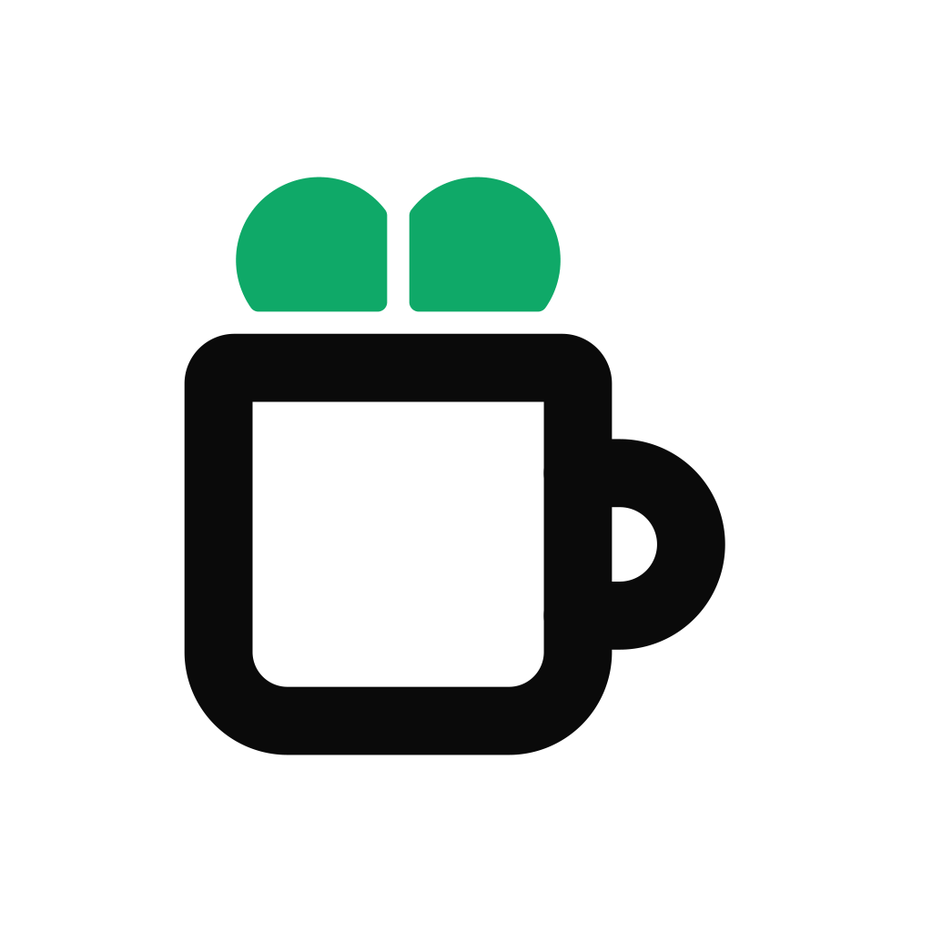
A heart rising out of a mug. The outline icon is the default at 32px and up. Below 32px the outline heart turns into dots, so use the solid one-color icon.

Icon
32px and up, light backgrounds.

Icon, dark
32px and up, dark backgrounds.

Solid icon, black
Below 32px, light backgrounds.

Solid icon, white
Below 32px, dark backgrounds.

Outline icon, black
One color, 32px and up.

Outline icon, white
One color on dark, 32px and up.






App icon
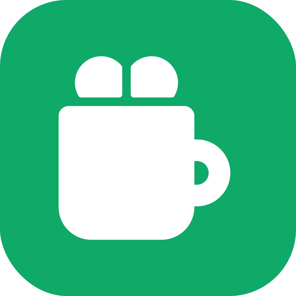
The icon on a rounded tile. The white tile with the solid mug is our favicon and app icon, and the best choice for a link or integration that shows Buildful as a square.
App icon
Favicon, integrations, directories.
App icon, outline
Large tiles on light pages.

App icon, green
Large tiles where color helps.


Wordmark
Lowercase “buildful” in Geist Medium, already outlined. Use it alone only when the icon is on the same screen.

Wordmark
Light backgrounds.

Wordmark, white
Dark backgrounds.


Usage
Keep the logo as drawn.
The icon is a heart rising out of a mug. Outline is the default style; the solid one-color style is for small sizes. There is no gradient version.
Do
- Use the files as they are. They are final artwork.
- Use the outline logo by default, and the solid one-color icon below 32px.
- Put the ink logo on light backgrounds, the white logo on dark, and the solid white logo on brand green.
- Leave clear space around the logo of at least twice the mug's line width on every side.
- Keep the icon at least 16px, and the logo's icon at least 15px tall (20px type).
- Use the wordmark alone only when the icon is on the same screen.
Don't
- Stretch, rotate, outline, or add shadows or effects.
- Recolor parts of the logo, make the mug green, or fill it with a gradient.
- Mix the outline and solid styles in one lockup.
- Move the heart out of the mug or change the spacing.
- Retype the wordmark in another font.
- Place the logo on a busy photo without a solid backing.
Colors
Ink, white and one green.
Green is an accent: the heart, dots and small highlights. For green text on white, use Green text. Download the CSS variables.
Ink
#0A0A0A
--bf-ink
Logo, headings, primary buttons
White
#FFFFFF
--bf-white
Backgrounds, logo on dark
Dark
#0B0F0D
--bf-dark
Dark sections and panels
Green
#0FA968
--bf-green
The heart, dots and accents. Never body text
Green text
#087A4B
--bf-green-text
Green text and links on white
Green on dark
#7FDDB0
--bf-green-soft
Green text on dark
Body
#4A4A4A
--bf-body
Body text on white
Muted
#6B6B6B
--bf-muted
Captions and secondary text
Mint
#F6FBF8
--bf-mint-50
Soft surfaces and notes
Border
#EBEBEB
--bf-border
Rules and card edges
Type
Geist and Geist Mono.
Both are free on Google Fonts. The wordmark is already outlined, so the logo needs no font.
- Get Geist on Google Fonts
Geist
Interface and headings. Headings at weight 450, not bold, in sentence case.
- Get Geist Mono on Google Fonts
Geist Mono
Labels, code, and numbers in data.
For AI agents
Give your agent the brand.
Everything on this page is also plain Markdown, with a direct link to every file. Hand it to your AI agent before it puts our logo in a design, a deck or a README.
Questions about the brand? hello@buildful.ai
PROMPT
Follow the Buildful brand guide at buildful.ai/brand.md and use the logo files it links to.
Social
Ready-made images for link previews and profiles.
Link preview, dark
Open Graph image, 1200 × 630.
Link preview, light
Open Graph image, 1200 × 630.
Profile banner
X and LinkedIn header, 1500 × 500.
Avatar
Profile picture, 400 × 400. Safe for circle crops.